Day 4- New York

Today we headed back to downtown Manhattan for the colour factory (a series of installations and activities by artists and designers to test your senses). The colour factory was fun but to be honest, pretty basic for the $42 we spent on tickets. It was 5/6 rooms that each artist had designed, based on a colour or food. You were given an activity or experience and then given a treat after to refresh your palette for the next room however we were only inside for about 50 minutes so it was rather pricey.

We wondered down to the 9/11 museum which was a very harrowing and emotional experience but I’m very glad I had the opportunity to go.

We then walked across Brooklyn bridge which again WAS FREEZING (!!) and explored Brooklyn, got an obligatory shake shack dinner and headed back to the hotel on the subway.

-Kirsty

Gucci Alchemist garden

diaryarticledouble_alchemistgarden-campaign-01_001_defaultWhilst being in New York, I ensured my eyes were peeled at all times for aesthetically pleasing layouts of how brands have displayed their fragrance in store for the upcoming module.

In my previous blog post I showed the different brands that stood out to me as being aesthetic, however I wanted to do a separate blog about gucci.

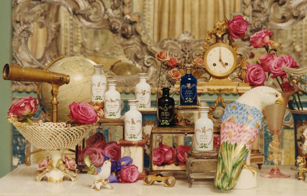
We stumbled upon an enormous gucci store and had to enter. The incredible contrast or pattern, colour and loud prints were overwhelming but incredible. Further down the store we came across the fragrance counter of their new ‘alchemist garden’ collection that came out a few weeks prior.

The website states that the collection is ‘Evocatively named, seven singular scents, blended with precious raw materials and flower essences, and designed to be layered with the line’s floral waters and perfumed oils to create an individual fragrance statement’

We took the opportunity to chat to the lady on the counter and ask a few questions about the collection.

Alessandro Michele has expressed his obsession with flowers in this collection, as well as bringing back nostalgic childhood memories. Michele’s idea to reflect on his childhood walks with his father inspired the names of the scents- each poetically titled to embody an emotion and reflect a personality trait.

Alessandro is very much a maximalist, he thinks more is more and loves mixing the old with the new. He expressed this by bring old techniques of perfume layering but creating new mixtures and scents. By layering the new collections scents, you can create a perfume that’s unique to you.

An interesting fact i also learn from this lady was that fragrance is stacked, so when you typically rub your wrists together, you’re crushing the molecular structure, in tern ruining the smell!

-Kirsty

Day 3- New York

Today was spent doing more touristy bits, we decided to venture to the High Line and walk down towards Soho and Chelsea. It was FREEZING. It was interesting to see what they had done to gentrify the High Line though, having art, sculptures and installations along the way to showcase local talent.

After wondering round downtown Manhattan, we made our way back to Times square to see what it was like at night, incredible but very very busy. We headed to The Black Tap for the best meal yet. I highly recommend (pricey but worth it) They sold all sorts or typical American foods, and being renowned for their burgers, we simply had to get one.

Shattered, we crawled back to the hotel to sleep for a busy day tomorrow.

-Kirsty

Day 2- NIKE STORE OUTCOMES

After a good nights sleep, we woke up bright and early in the hope to get all the obligatory tourist activities over and done with. Our first activity was Times Square. I loved the buzz and atmosphere of it however we were eager to return in the dark to get the full experience of the lights. We then headed to Grand Central station and then on to 5th Avenue to see the new Virgil Abloh installation on the Louis Vuitton flagship store.

The highlight of my day was visiting the Nike store. I immediately found myself poiting out the various forms of FCP outcome, such as event, space and digital. For event, they had incorporated a room for ‘personalise your own trainers’. Visitors can participate in a workshop, altering the design, colour, laces and stitching of their chosen trainers. The use of space was also interesting, the store had set up an area that looked like a design shop, there were sketches and threads to show the consumer the design process. The digital outcome was used at the checkout. The shopper could download the nike app and choose their trainers, scan the QR code with their phone, pay by phone, grab a bag and go. I had not seen this done before and will attach some photos below.

We finished the day at Chelsea market, it was full of nice food stalls and independent businesses selling jewellery and bric a brac and lovely to wonder around and grab dinner.

-Kirsty


Day 1- New York

Day one was utterly knackering. We finally arrived after being awake for what seemed like three days- not sleeping before the flight did not help and combined with not a wink on the flight itself, we were all hungry and tired. However we powered through and made the most of the remainder of the day.

After dumping our bags in our rooms at the hotel, we set off exploring the city. We headed to Maddison Square Gardens and after grabbing some food, we visited the empire state and Rockefellar tower. For $49 it was tempting to give it a miss but I’m so glad we did it. The sunset was incredible and the view was even better than i’d imagined it to be!

Tailoring trends 2019

In recent catwalks I’ve seen a vast amount of tailoring being shown in the SS/19 catwalks recently but not traditional suits. Womenswear has seen a new take of colour, vibrance and it seems they have taken an approach of ‘the bolder the better’. As for men, the trailing trend is equally as prominent, however its taken a casual, sports vibe. Playing around with loose, touchy cuts and the use of performance fabrics suggests they have adopted a less formal look, instead of suits and polished shoes, its now suits and trainers.

double-breasted-comp-gq-28jun18_b

multicoloured.jpg

The Shoot

For the outcomes state of the term, we were asked to create a shoot, having taken inspiration from the July 2012 Vogue shoot by Josh Olins- A clean slate.

Our concept was called ‘Purgatory’. Our idea for this was to explore the relationship between artificial and organic form. We were instructed to include the accessory of a ‘bag’ in our shoot, in relation to our five chosen words, ‘INDEPENDENT, PRIMARY, LINEAR, PERSPECTIVE, CLASSIC’.

We executed this shoot in Bonington Art Gallery, using the sharp architecture of the building and natural lightening to our advantage. Inspired by Chloe’s feminine form, we decided to try and present her as natural as possible, whilst still incorporating the use of primary colours, red blue and yellow in a linear fashion in her makeup.

We also used materials like acrylic sheets and cardboard to further enhance the organic form of Chloe’s body. The brown vintage ‘Hermes’ bag  featured in our shoot is a fashion classic , and coupled with this, the lone powerful figure displays confidence and authority which relates back to our key words.

She resides in between both states, hard and soft, overt and covert, organic and artificial, resulting in the concept name ‘Purgatory.’

-Kirsty


Josh Olins- A new-gen photographer

The past weeks lectures and seminars have been based on introducing the second half of the outcomes stage (the visual analysis being the first). My new group and I were given a Vogue 2012 shoot by Josh Olins.

Olins is renowned for the precise composition of his shots, creating an elegance in his work. We started by analysing the spreads in depth, picking out key visual componants such as block colour, proportion, geometric patterns, layering and structured clothes. From these words, we collected 5 or the broadest words that we could take forward when coming up with ideas for our own photoshoot. Our words are- PROPORTION, INDEPENDENT, PRIMARY, CLASSIC and LINEAR. Another brainstorm lead to a bigger breadth of words such as dynamic, transcendent, timeless and minimalistic, these will help us when thinking of shoot ideas.

I decided to research into more of Olins’ shoots, two of my favourites were- Clash of the Tartans, for Vogue and Stable pieces for WSJ magazine. The use of bold colours and clashing patterns in his vogue shoot were extremely striking, whereas the shoot for WSJ was much more understated and the use of B&W made me admire the composition of the photo rather the obvious aesthetics you see when first glancing at an image. I will attach below photos of A clean slate, Clash of the Tartans and Stable pieces.

-Kirsty

Screen Shot 2018-11-30 at 11.37.00Screen Shot 2018-11-30 at 11.37.20

Wealden Times Christmas Fair

When I initially toyed with the thought of doing a degree, it was a choice between a Fashion based degree or Interior design. When I was younger I permanently nagged my parents to redecorate my bedroom constantly; I love the shabby chic aesthetic of making interiors look sophisticated and tasteful yet rustic- basically things decorative!

With my Mother owning a jewellery design business, I’ve always enjoyed helping her set up for seasonal fairs and exhibitions (mainly so I could have a nosey at the lifestyle and homeware stalls). My favourite of them all was the Wealden times Christmas fair, however I never had the chance to venture that far away from my Mother’s exhibition because she was always running it! With a change of career path, this year I finally got the opportunity to go as customer’s with my Mum and Auntie. I was so inspired by how each company had designed their stall in such a way that you could imagine the items in your home. I would highly recommend a visit, even if just for a christmassy day out! I took a few phots of my favourite exhibitors stalls that I will attach below.

-Kirsty

Summative: Contexts- Outcome

With Lens being my allocated outcome, I started immediately by brainstorming types of possible lens campaigns, such as photography, billboards, adverts, youtube, snapchat, instagram, cinema and posters. Along with the Pros and Cons of what lens campaigns can and cannot achieve.

After this initial research, I decided to have a look a previous AllSaints Lens campaigns to gain inspiration. I soon discovered the Spring 2018 campaign called Out of Season. I found this campaign particularly interesting because how interactive they have managed to make a normally very un-interactive way of advertising. The campaign consists of a series of pictures and a 60 second video featuring normal everyday people wearing AllSaints clothes. Customers would then get emails introducing them to the cast members, in which they could shop the look of their favourite actor/actress. The use of normal people in this campaign is a guerrilla style of marketing because we are so used to seeing big- name models in front of the lens. Since real people will be buying and wearing the clothes AllSaints decided to show off such people in their campaigns, it makes sense.