After my recent blog post (insight to vis con), I can’t help but notice the use of visual contrast in campaigns and ads now!
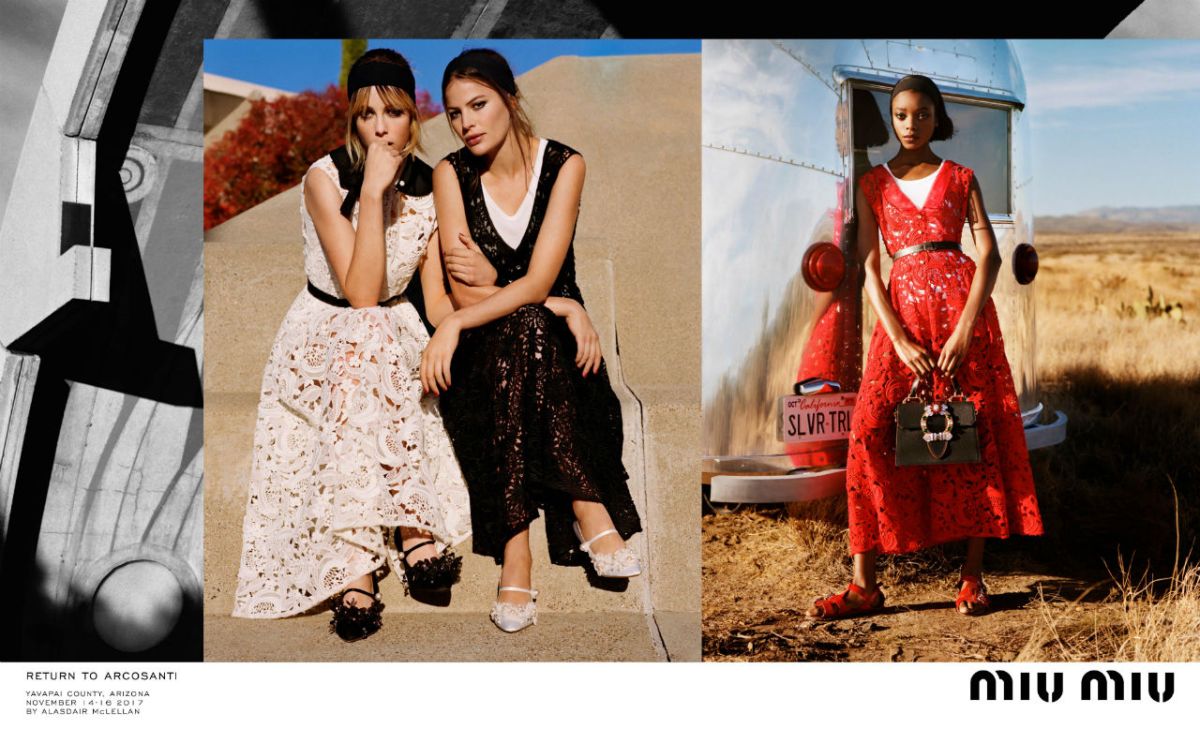
I recently came across this image that fed my inspiration for a blog post- Miu Miu’s Spring/Summer 2018 campaign (RETURN TO ARCOSANTI). This campaign is just bursting with visual contrasts and I couldn’t help myself but to pick it apart and distinguish the interesting use of visual contrast that has been lensed by Alasdair McLellan. The whole campaign has been based on the same contrasts but I chose this one to look at in more depth.
- Hot vs cold- The tones in the red dress, warm earthy tones and red tree combined with the cool blues of the sky and the silver truck creates a tonal contrast in the image.
- Linear vs Painterly- The linear structure of the steps and monochrome architecture, creates a contrast with the painterly silhouette of the women featuring.
- Colour vs Mono- The foreground images are bursting with colour however the background image has been shot in mono creating a colour contrast.
- Technical vs Organic- The industrial structure of the concrete, along with the metallic vehicle clashes with the organic form of the human body and landscape.
- Single vs Multiple- The most obvious contrast in the image is that there is one model on the right hand side image wheres as the left hand image contains two women, creating a single vs multiple contrast.
-Kirsty
